
The Awava mark.
One chevron system: A rises, V falls, and the W — the only place colour appears — carries the brand gradient. Every stroke on this page shares a single 30° angle, mitred joins and round terminals.
The wordmark.
The default signature. Use it wherever there is horizontal room — navigation, documents, email, vehicle livery. Never set the name in a typeface as a substitute.




On ink or photography, use the reversed wordmark. The W brightens one step so it holds its contrast against a dark field.
The AWA mark.
Three chevrons interlocked — an A, the W, and an A. Use it where the full wordmark would not survive: app icons, avatars, favicons, a single embroidered chest hit.
Tiles and favicons.
The ink tile is the default everywhere an app icon is required. The blue tile is for light interfaces that need the brand to carry; the white tile is for dark ones.
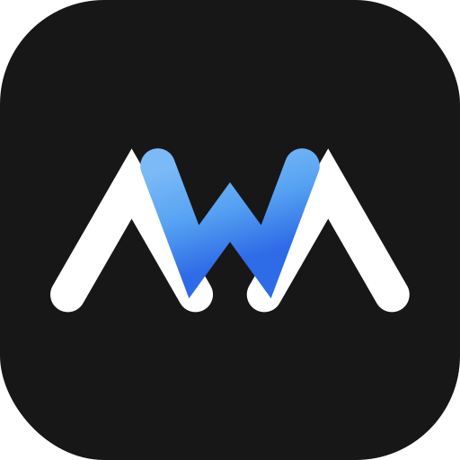
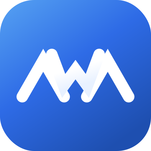
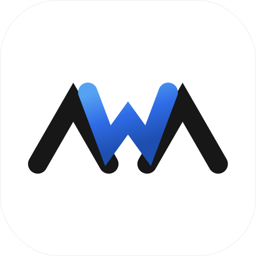
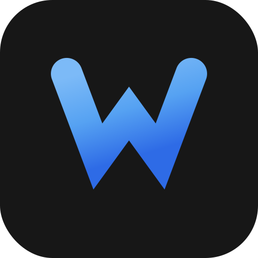
 16px
16px 32px
32px 48px
48px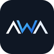 180px
180pxFavicons use a heavier stroke and a tighter tile than the app icon — at 16px the standard weight silts up. Regenerate any size with python3 tools/render-icons.py.
One angle, three glyphs.
Every letter in the system is the same chevron rotated or reflected. The arms sit at 30° from vertical, the stroke is 21% of the cap height, joins are mitred and terminals are round. That single rule is what keeps the wordmark, the monogram and the icons reading as one object.
- Arm angle30° from vertical, on every glyph, at every size.
- Stroke weight26 units against a 123-unit cap height in the wordmark; 44 against 205 in the monogram.
- JoinsMitred, limit 8 — the sharp point is the mark. Never switch to round joins.
- TerminalsRound. The contrast between sharp joins and round ends is deliberate.
- Clear spaceKeep one cap height of empty space on every side. More is fine; less is not.
THE SYSTEM
One ink ladder, one accent.
Headings, body copy and every 1px border come from the ink ladder. Awava blue appears only in the roles below — CTAs, links, active states, stat numbers, icons, and the W.
Five ways to break it.
- Use the supplied SVGs. They scale to any size without a blurry edge.
- Keep one cap height of clear space on every side.
- Let the dark strokes inherit the surrounding ink colour.
- Reverse to white on ink, photography, or any dark field.
- Use the monogram — not a cropped wordmark — when space is tight.
- Recolour the W. It is the only accent and it is fixed.
- Add a shadow, glow, bevel, or outline of any kind.
- Stretch, condense, rotate, or re-space the glyphs.
- Set “Awava” in a typeface and call it the wordmark.
- Place the mark on a busy photograph without a solid field behind it.
Everything, in one place.
All vectors live in assets/img/. The PNG sizes are generated from the same geometry by tools/render-icons.py — edit the SVG, rerun the script, and every raster size stays in step.
- awava-wordmark.svgPrimary wordmark — ink strokes, gradient W. Also -navy, -white, -mono.
- awava-mark.svgAWA monogram. Also -navy, -white, -mono.
- awava-w.svgThe W on its own, as a graphic device.
- awava-icon-ink.svgApp icon tiles — also -blue, -light, -w-ink, -w-blue.
- awava-favicon.svgFavicon tile with the heavier small-size stroke.
- awava-favicon-16/32/48.pngRasterised favicons.
- awava-icon-180/512/1024.pngTouch icon and store-sized app icons.
- awava-mark-512.pngTransparent monogram for decks and signatures.
Stop losing jobs to voicemail.
Fifteen minutes. We will show you exactly what your system would look like, what it costs, and what it should return.